This one had a curious double gestation. I painted a large seated nude at a life class a few weeks ago. I thought it was pretty bad. When I looked at it a few days later I realised it was awful, and I wouldn’t want anyone to see it. The only solution was the ultimate one, a thick layer of paint, all over. The only paint I had in abundance was an old jar of ultramarine blue, so I now had a large, very blue canvas. I wondered what to do, and thought it looked rather under-watery. That reminded me of the short video by the Welsh artist, Natasha Brookes, of swimming in Welsh lakes, high in Snowdonia, in the winter. The video is below, but I suggest you dress up warm and have a hot drink ready, it is REALLY COLD. But looks stunning.
//kkpj.mediatankhq.com/video/blue-hue/embed
Blue Hue

I thought the still from the video was beautiful, and could form a basis of painting.
It is hard to avoid dropping into some terrible kitsch with pictures like this and I am not sure that I have avoided that completely, but it was fun to try. As a photograph it is wonderful, and you can’t feel the cold from it.

The first stage was to break up the overall blue a bit. Very hard to put a name on some of the colours, and that makes it very difficult to choose colours. I just have to build them up in layers. Here I have tried to show the bright sunlight and lighter bottom area, with the deep ultramarine in between. The sun is too large and central. All this is done with a palette knife. Brushes just can’t do it.

Next, the whole surface was completely reworked with fairly transparent colours and the sky brightness moved and reduced, again all palette knife work. Constant scraping. More like plastering a wall than painting. I’m hoping to get colour variation through overlaying different areas, rather than patches of different colours.

Another complete reworking of the whole surface. The photo doesn’t show the colour variation very well. It was starting to look fairly deep and wet. I have been resisting the urge to draw fishes. So far successfully…

Natasha puts in her first appearance. This is just a chalk outline to get her position and proportions. I thought this looked so ethereal that I was tempted to leave her just like this. But I could see that her legs were too long and her hand too small. So on with the paint.

Some very thin white acrylic to establish shape and highlights. I tried with the palette knife, but here I needed to use brushes. You can see how much I shortened her legs, and the indications of bubbles in chalk. I was wishing I had left her in outline at this stage.

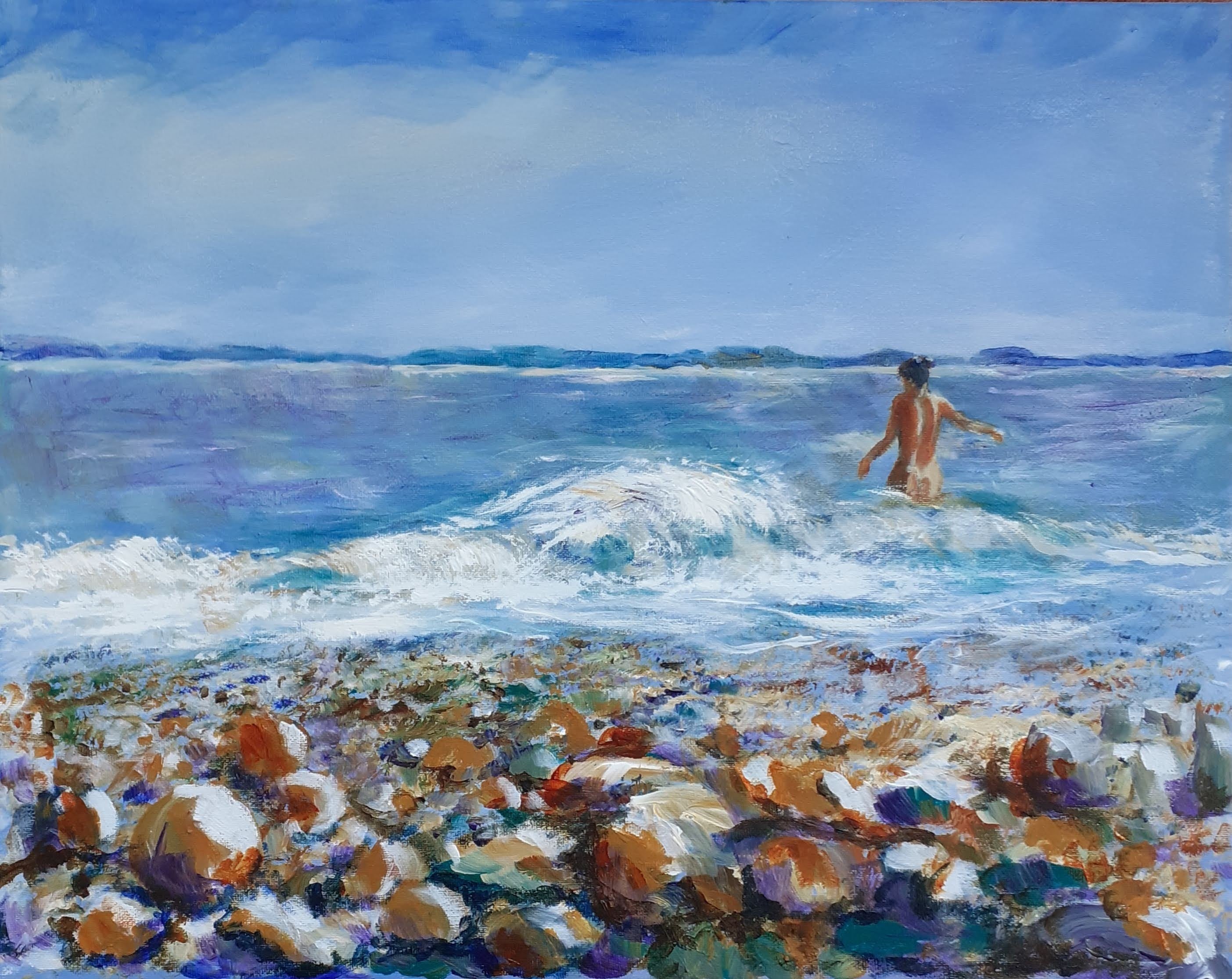
As she stands at present, although I am sure I will continue tinkering. The colours are richer in real life, there is too much flare here. I really should use something better than my phone for these pictures.
I think the proportions of the original photo are better, but I quite like her. But is it just kitsch? Is that a problem anyway?
