I’ve produced my very first woodcut print. Hadn’t really planned to. I saw a lovely photograph of a black-headed seagull in the Café on Brownsea Island. Took a photo of the photo.
I wanted to do a sketch of the photo and just thought that it would fit nicely on the chunk of plywood I had in my studio for some other purpose. Having sketched it in black chalk, I thought, “I could just cut around that and print from it”. So I did. Carved the outline with lino cutters (probably to their detriment) and then hacked out the background with carpenter’s chisels. Is a horrible material. It doesn’t chip out, it just rips. I lost part of its tail and nearly lost its head.
But in the end, I like the print. Just lively and perky, like the original bird. I will try it again, but not with shuttering ply. I have a nice block of lime wood which I think will be much better.
Today was all about preparation. I bought 10 sheets of Zyrkal printing paper and cut them in half. Then cut five more MDF backing boards with a router, nearly messing up all of them in the process (always check TWICE… ). Stuck lino to each. I’m ready for at least three more designs, if not six. Stuck registration tabs on each sheet, using the new Ternes Burton registration pins I got from Handprinted in Bognor Regis, who delivered in under 24 hours. I’ve never used them before, but they look like they should work. Keeping everything registered is crucial. Now just need to get drawing.
The final layer is added (blue), sealed and I have signed and numbered all eight.
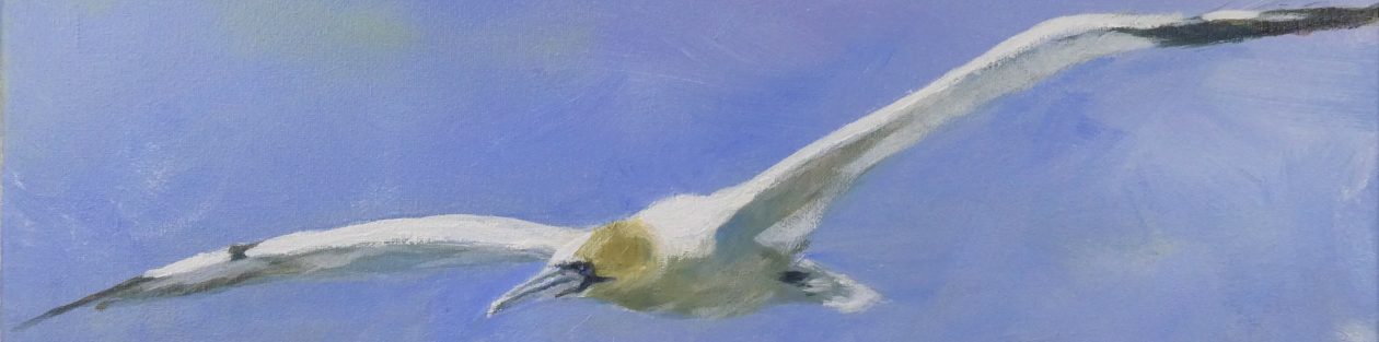
Overall I am pleased with the result, as I am very new to this medium. This is only the third reduction lino print I have created, and the first multi block one. I am planning a series of prints of Poole Harbour birds, with this the first. Overall size is 270*380mm and the image size is 150*180mm.
I am planning to sell these prints at £60 each, unmounted but including UK postage. If you are interested, please contact me at julian.swindell@gmail.com
One more colour layer to go, which will be a darker blue. Possibly shadows afters that, but dependent on how the blue works out. I’m not completely convinced by this brown layer. Some of the foreground/background contrast is lost. No way of going back to change anything
The eighth stage of this lengthy process. A light blue layer for the sky and some of the water. I’ve carved lines out of the background for reeds. These show as the previous yellow layer and will have a darker sienna added to them next.
The first background layer, printed from the second block. This is a long, multi stage process, which is part of what I like about it. You gradually see the image emerging, and can makes changes at each stage.
This color is meant to form the basis of a reed bed behind the duck. Just a few areas of white cut out for highlights and cloudy effects.
My main concern was how well the second block would register with the first. In particular, it is slightly loose in the frame so I need to push it into the same position each time.
I’m pleased with the result, but every time I add to an image, I think it looked better without the addition. I think the duck sat better in the overall sheet than it does in this more restricted rectangle. Now to leave it to dry and to think.
I’ve added the final black layer, which defines the whole shape of the bird. I’m pleased with the result so far. Will have to work on the background block next, which is a bit intimidating.
Not much of the block left now, after all of the reduction. There will be no more than eight prints in this series.
I like making them more than using them at the moment. This one incorporates ideas from the first two. The covering paper is some wonderful wrapping paper from the Bodelian library. Linings are two lino cut prints i had lying around. There is now room for a pen. It is bound with proper book tape from the wonderful Vintage Paper Company in Orkney. Where you can also get unsold watercolour paper made in the early 20th century.
Couldn’t resist the beak. Not as bright as I had in mind, but that is not a bad thing, I expect. Only applied ink to the beak area as it is the only red. Just the black layer to do on the bird block. I am away all day tomorrow, so that will give this all a chance to dry fully.
Printing on the third layer. This should be the colour of the chestnut band around the bird’s chest. Below are the basic tools of the trade.
The paper located on the Boswell device. The baren, which is the black disk you rub the back of the print with to transfer the ink from the block. A sheet of glass with the ink rolled out “just so” and the roller, which I think printers call the braer for some reason. This is my new soft roller, bought on Laura Boswell’s advice,and she was right, it really makes a difference.
Paper in place, about to be lowered onto the inked block. Some of the block had been cut away since the previous yellow printing, so they should stay yellow. The rest of the yellow should be covered by the burnt sienna.
The print lifted after buffing the back with the baren. Next layer will be the red beak, but I really need to leave this to dry fully before doing any more.