Four colour lino blockĀ 

As an experiment (I am very new to this medium) I have tried to print my girl on the dockside in four colours. I have also tried using acrylic paint mixed with a print medium as ink. Not that great really. I think proper ink is probably better. 
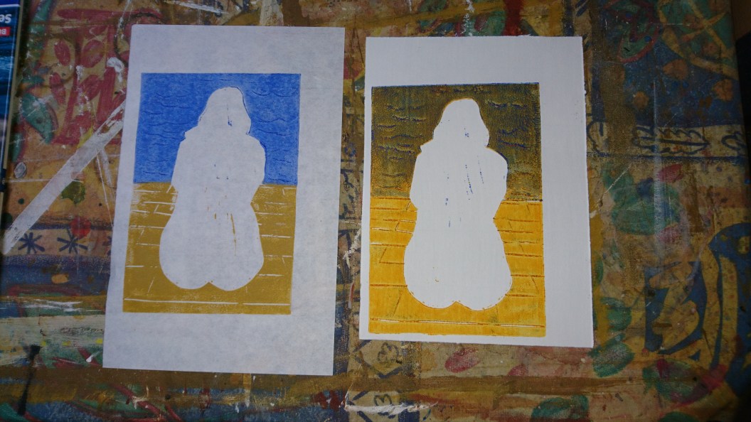

First, I cut a new block which simply had the figure cut out completely, so I could print colour where the water and dock were. I printed in two ways. On the right, I printed yellow acrylic over the whole block. When dry, I covered the dock area and inked the water only in blue acrylic and printed it over the yellow. Very dark, greenish outcome as the acrylic is very transparent. On the left, I have printed yellow ochre ink just over the dock, and then the blue acrylic over white paper at the top. 


Then I inked up the body /shadow block with two colours of ink. You have to resist the urge to roll from side to side, which would spoil the effect. 


Adding the body looks quite good on both, but the dark water doesn’t give the feel of a hot sunny day that I want. 


Finally the line block added. I like the results, but not sure it’s an improvement over the original simpler two colour block. That really looked hot. 

Tuesday Stroud life drawing group

Went back to this group for the first time in a couple of years. It is nice to just sit and draw. One pose all evening. Nearly 30 people there of all abilities. 


I did just this one drawing, working on the linear feathering technique again. I am going to vary it next time, to follow the body more closely. I like the general composition, but her head and neck are out of proportion with the rest of her. This is on cheap wrapping paper, which can’t hold much pastel. I’ll use better next time. 

Mother’s day lino cut

This was a very quick linocut I did fit my wife for mother’s day lady Sunday (here in the UK at least). The first pull was directly onto a card and I thought the ink was too heavy. I rubbed on a piece of Japanese paper without re-inking the block. It is a bit faded, but far nicer. There are two colours of ink more or less mixed on the block. 

Lino printing with a pressĀ 

I bought myself a small, manual press, which works surprisingly well. 

Basically, it is a lever press which about doubles your force. I use a bit of felt on top of the paper. I might try just turning it all over as the base is a dense foam. 

I’ve been working up another two colour print based on one of my favourite life sketches, my Neuroscientist. 


I took the easy approach. Photographed the drawing and traced it directly off the tablet screen at the block size. As a neat, simple outline, I think she looks good. 


Then another tracing, coloured up to show a white body on a black background. I thought the seat was far too prominent so had another go. Tracing paper is wonderful stuff. 


The balance between body and chair is better. As I did the body on one sheet of tracing and the coloured chair on another, it was easy to try out a black body on a white background. 


I went for this. It really emphasises the slanting composition. 


The block had to be carved in reverse, which tracing paper excels at. I used a proper transfer paper between the tracing and the block, which worked beautifully. Before I carved the body block, I decided to cut it down to square. This removes most of her face, which wasn’t working out well and would be hard to cut in lino. I think the balance works better as well. 


The first print from the press. Far better than I was getting by rubbing the back with a spoon. I really liked the look of this and wished I hadn’t bothered with the second colour. The line work has stayed clear. 


The whole printing area after I had pulled three prints. 


Second colour added, which looks good, although the registration is not great. I still think pure black would have been better. 


Mother and daughter, if that’s the appropriate expression. 

Stroud drop in life class

I went back to the Stroud drop in life drawing class for the first time in a couple of years. Inspired to do so after visiting their annual show yesterday. It was lovely just spending three hours drawing however you wanted. I used pastels and tried Max Hale’s vertical line technique, which works so well for landscapes. A lovely, excellent model called Maisey, which made it an extra treat. I seemed to have been drawing middle aged men for years. 

http://www.stroudlifedrawing.com/

More linoprints

I am really enjoying playing with lino. Hard to say why. I think the physical carving of the block is very satisfying. Inking and printing is still difficult. I’ve had a go at another two-colour print. 

Just black and burnt sienna. They are the only printing inks I have. The two blocks are at the top right. The burnt sienna block has very little on it. I had thought of including more, but I like the composition. 

I may add a little embellishment. I think she would like a gold necklace. I will sign them with my Chinese seal when I they are dry. 

Oil painting

Not my favourite medium, although I have done quite a few in the past. Still working with our restricted pallette of red, yellow, blue and white. It is useful, but when I’m out of class I use all sorts of colours. Orange and purple are good! 

This nude is not great, but she has since monumental qualities. 

Two colour lino printsĀ 

I’m enjoying the lino printing. One thing I find hard is that it is slow. You need to take more time than I naturally do. 

I thought my dancing nude would look better with no background at all, a la Eric Gill (an artist whose work is a problem to me. I think it is wonderful, but I find him abhorrent personally. Always a difficulty.) 


I think she does look much better this way. Good thing as there is no going back when you have carved the block. This is on a light, Italian printing paper. 

Then I thought I would try a second colour. 


I like this too, on thin Japanese paper. The burnt sienna is just rolled onto a cut out bit of soft cut lino and hand positioned. 

The problem is I will soon have a house full of prints.